
10 Hallway And Stairs Ideas Paint Colors
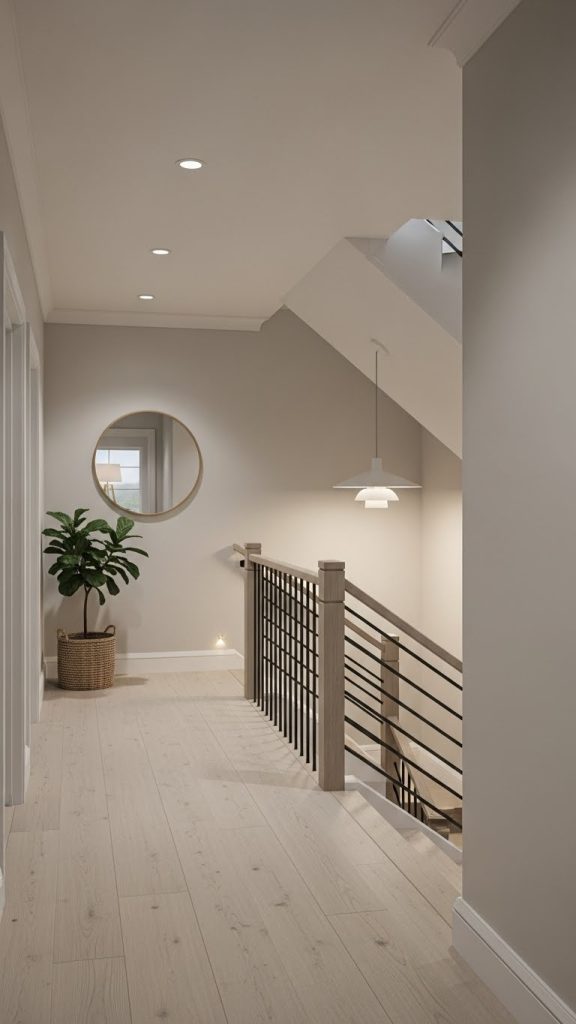
Hallways and staircases are the connective tissue of a home. They are spaces of movement, pause, ascent, and descent. Unlike rooms designed for staying, these areas are designed for passing through — yet they influence how the entire home feels. They are often the first interior spaces we encounter and the last we leave behind.
Despite this importance, hallways and stairs are frequently painted as an afterthought. White, beige, or leftover paint from another room is often applied without consideration. The result is a space that feels unfinished, disconnected, or emotionally flat.
Paint color in hallways and staircases behaves differently than in standard rooms. These areas often have limited natural light, unusual proportions, and vertical movement. Color here must work harder. It must guide the eye, soften transitions, and create continuity across floors.

When chosen thoughtfully, paint color can make hallways feel wider, stairs feel safer and calmer, and vertical movement feel intentional rather than awkward. Color can also help unify different levels of a home, creating a cohesive story rather than a series of disconnected spaces.
This essay explores ten hallway and staircase paint color ideas that balance practicality, atmosphere, and timeless design. Each idea considers how color interacts with light, architecture, and movement — ensuring the result feels intentional, elegant, and lived-in.
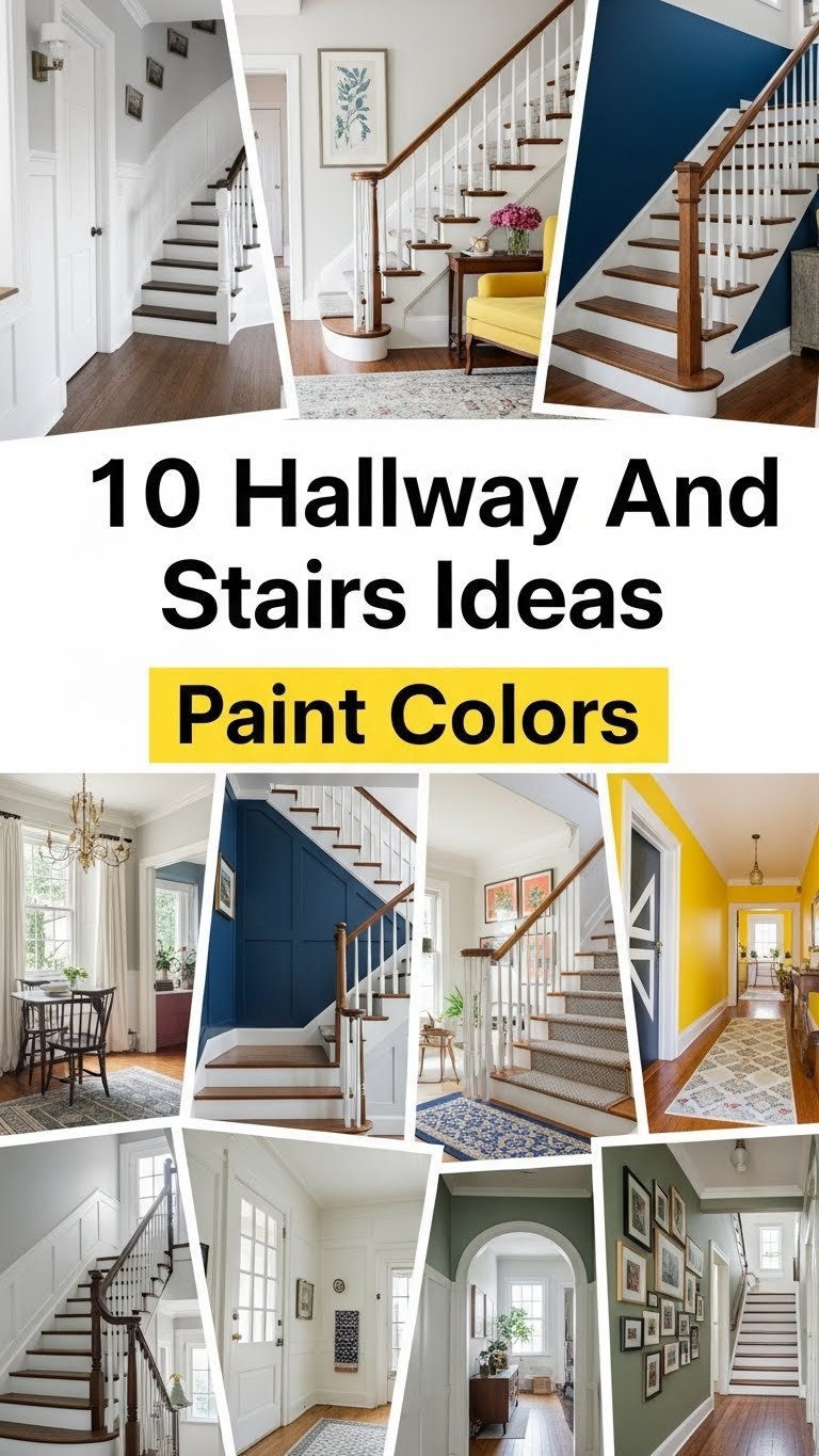
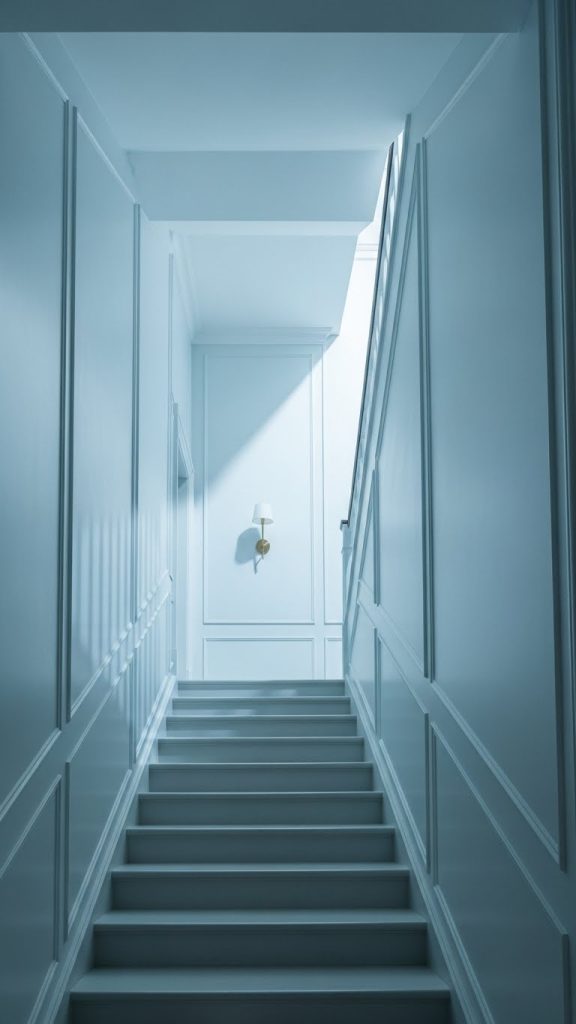
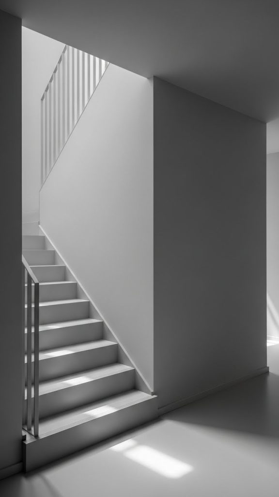
1. Warm Soft White for Timeless Continuity
Soft white is one of the most effective colors for hallways and staircases — when chosen correctly.
Unlike stark or cool whites, warm whites contain subtle undertones of cream, ivory, or beige. These undertones prevent the space from feeling cold or clinical, especially in areas with limited daylight.
In staircases, warm white reflects light gently, helping brighten vertical movement without glare. In hallways, it creates continuity between rooms, allowing artwork, woodwork, or architectural details to stand out.
This color choice is ideal for homes with varied room colors, as it acts as a neutral connector that doesn’t compete or clash.
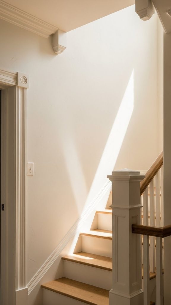
2. Light Greige for Subtle Depth
Greige — a balanced blend of grey and beige — is exceptionally well-suited for hallways and stairs.
It offers more depth than white while remaining neutral enough to support surrounding spaces. Greige adapts well to both warm and cool lighting conditions, making it reliable in areas with inconsistent natural light.
On staircases, greige feels grounding and safe. In hallways, it adds quiet sophistication without drawing attention to itself.
This color works especially well in modern, transitional, or European-inspired interiors where restraint and harmony matter.
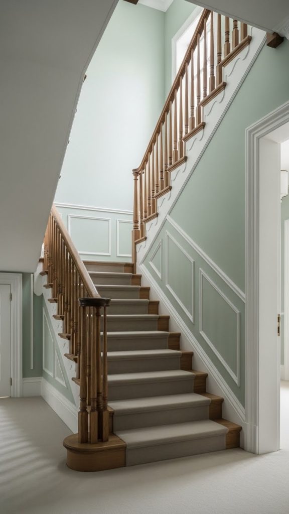
3. Soft Sage Green for Calm Flow
Sage green introduces color without drama.
Muted green tones evoke calm, balance, and connection to nature — qualities that are especially beneficial in transitional spaces. In staircases, sage green softens vertical movement, making ascents and descents feel more relaxed.
In hallways, this color pairs beautifully with wood floors, white trim, and natural textures. It adds personality without overwhelming narrow spaces.
Sage green is particularly effective in homes where the hallway connects living areas, as it provides a gentle visual pause between rooms.
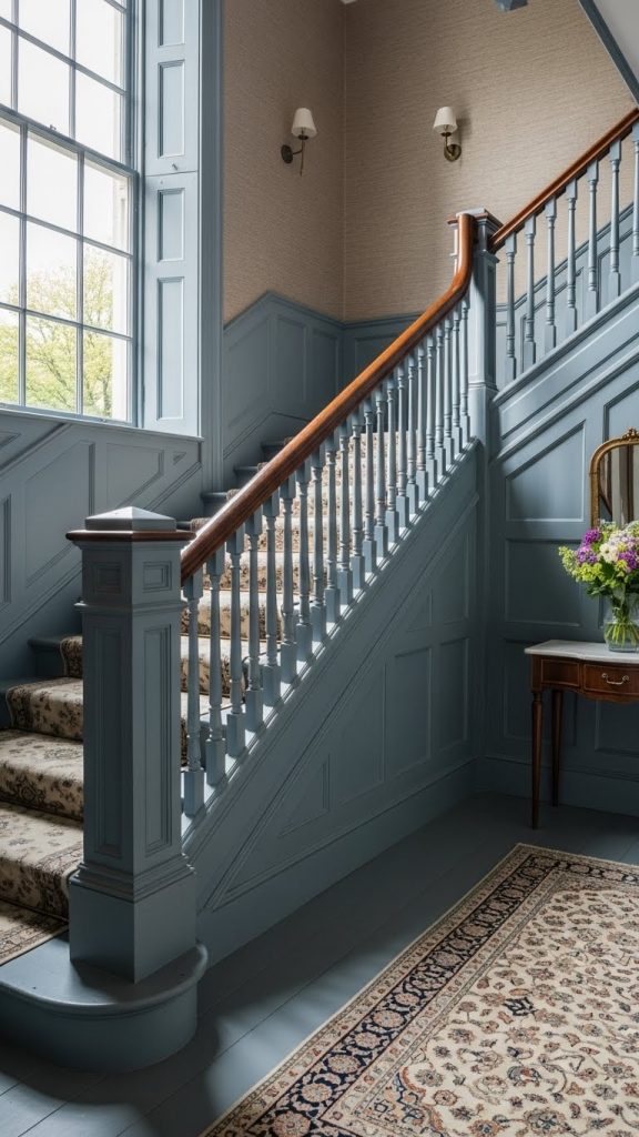
4. Pale Blue-Gray for Airy Elegance
Blue-gray tones combine the serenity of blue with the neutrality of gray.
In hallways, pale blue-gray creates an airy, open feeling, especially in spaces that lack windows. The cool undertones recede visually, making narrow corridors feel wider.
On staircases, this color feels light and graceful, encouraging upward movement without heaviness.
The key is choosing a softened blue-gray rather than a saturated or icy tone. Subtlety ensures elegance rather than chilliness.
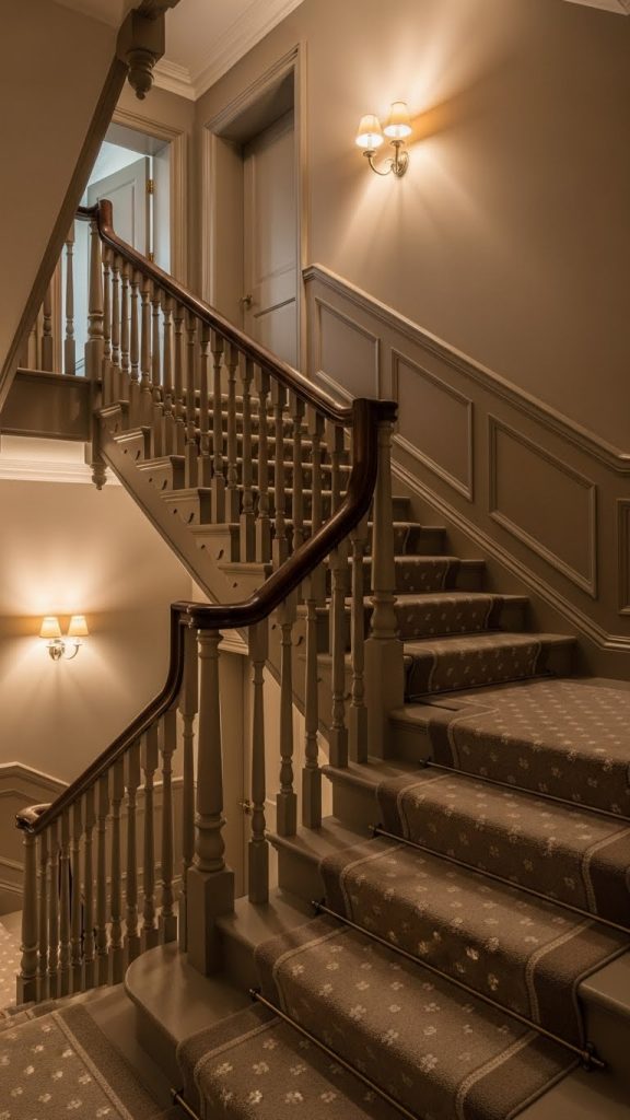
5. Taupe for Warm Sophistication
Taupe is an understated yet powerful choice for hallways and stairs.
This color sits comfortably between brown and gray, offering warmth without darkness. It works beautifully in homes with traditional or classic architectural elements.
In stairwells, taupe adds richness and depth, making the space feel anchored and intentional. In hallways, it supports artwork and wood finishes without competing.
Taupe is especially effective when paired with white trim and warm lighting, creating a polished and welcoming transition zone.
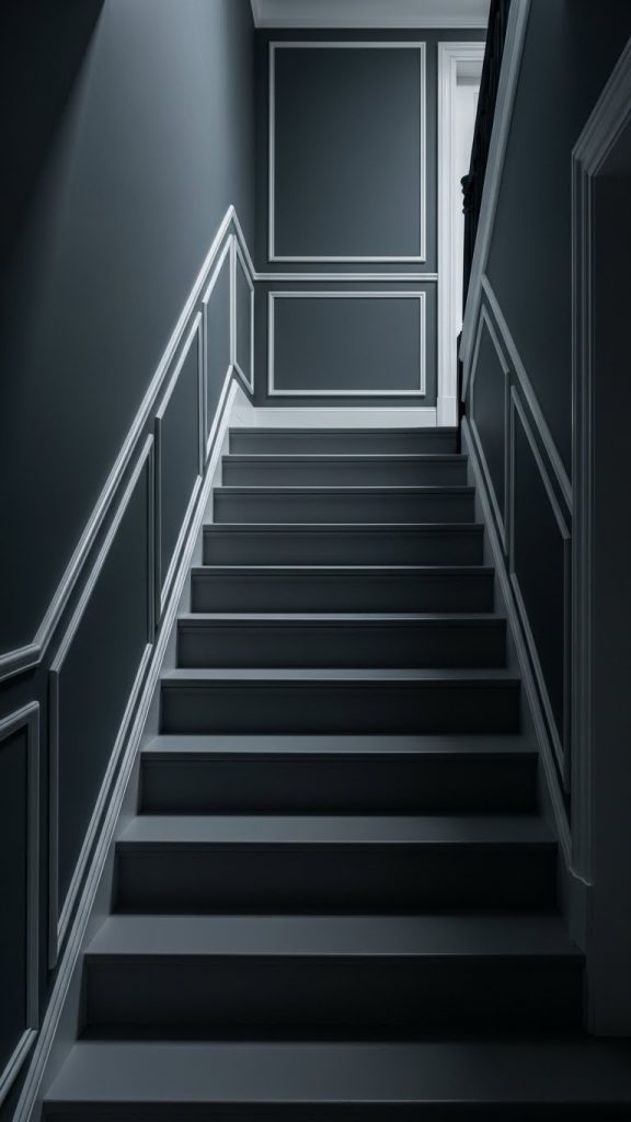
6. Muted Charcoal for Dramatic Depth
Dark colors can work in hallways and staircases — when used strategically.
Muted charcoal, rather than pure black or dark gray, introduces drama while maintaining sophistication. This color is best used in staircases with good lighting or at the end of long hallways to draw the eye forward.
Charcoal creates contrast that highlights architectural features such as railings, moldings, or artwork.
This choice suits homes with modern or industrial elements and works best when balanced with lighter adjacent spaces.
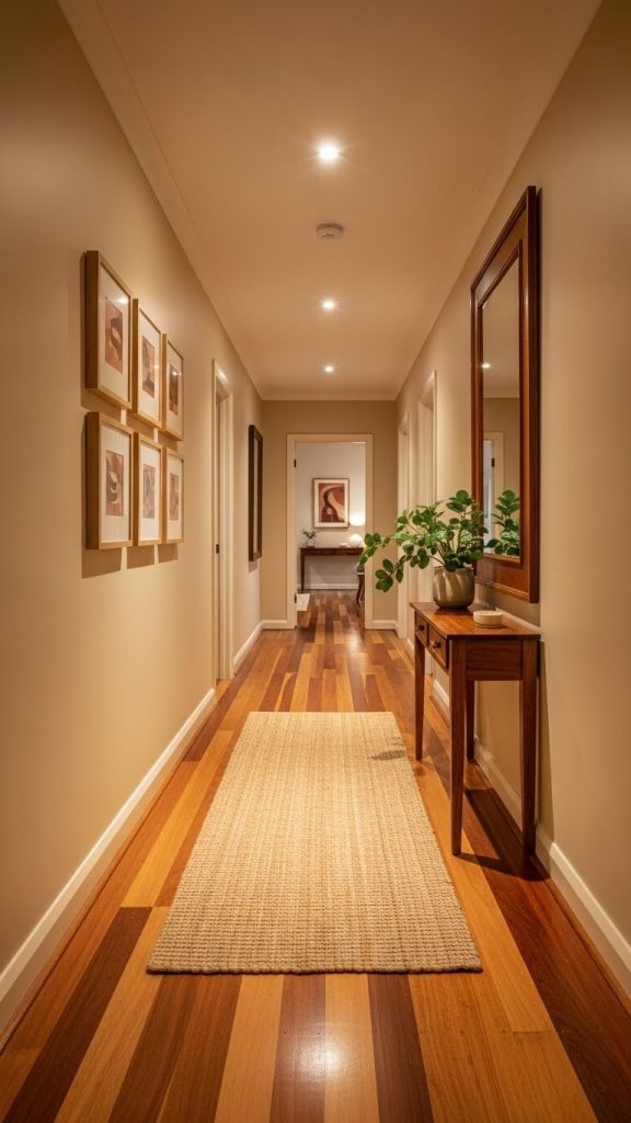
7. Earthy Beige for Warm Neutral Flow
Beige has evolved far beyond its outdated reputation.
Modern earthy beiges incorporate soft clay, sand, or stone undertones that feel warm and grounded. In hallways and staircases, these tones create continuity and comfort.
Earthy beige works particularly well in family homes, where transitions should feel gentle and forgiving. It pairs easily with wood, tile, and neutral decor.
This color choice creates a welcoming passage that feels familiar and calm rather than stark.
8. Dusty Blue for Classic Character
Dusty blue offers a sense of heritage and calm.
Unlike bright or saturated blues, dusty tones feel softened by gray or beige undertones. This makes them ideal for hallways and stairs, where subtle character is preferred over bold statements.
Dusty blue works beautifully in older homes, cottages, or traditional interiors. It adds color while respecting architectural history.
In staircases, it encourages a slower, more thoughtful movement, enhancing the feeling of transition.
9. Monochromatic Color Across Walls and Trim
Using the same color on walls and trim creates a seamless, modern effect.
This approach reduces visual breaks, making hallways and staircases feel larger and more cohesive. It is particularly effective in narrow spaces or stairwells with complex angles.
Neutral tones work best for this technique — soft whites, greiges, or light taupes. The subtle difference in sheen between walls and trim provides enough distinction.
This strategy emphasizes form and light rather than contrast.
10. Gradient or Two-Tone Staircase Color Transition
For homes with longer staircases or multi-level layouts, a gentle color transition can be incredibly effective.
Using a slightly darker tone at the bottom of the stairs and a lighter version toward the top creates visual movement and balance. The transition can be subtle enough to feel natural rather than decorative.
This technique guides the eye upward and reinforces the vertical journey of the staircase.
When done thoughtfully, it adds sophistication and architectural interest without overwhelming the space.
Conclusion: Color as a Guide, Not a Distraction
Hallways and staircases do not need bold statements to feel intentional. They need clarity, continuity, and calm.
The right paint color supports movement rather than interrupting it. It guides the eye, softens transitions, and creates emotional coherence throughout the home.
Whether through warm neutrals, soft colors, or strategic depth, paint transforms these overlooked spaces into meaningful parts of the interior experience.
When color is chosen with care, the journey through the home becomes as beautiful as the destinations themselves.